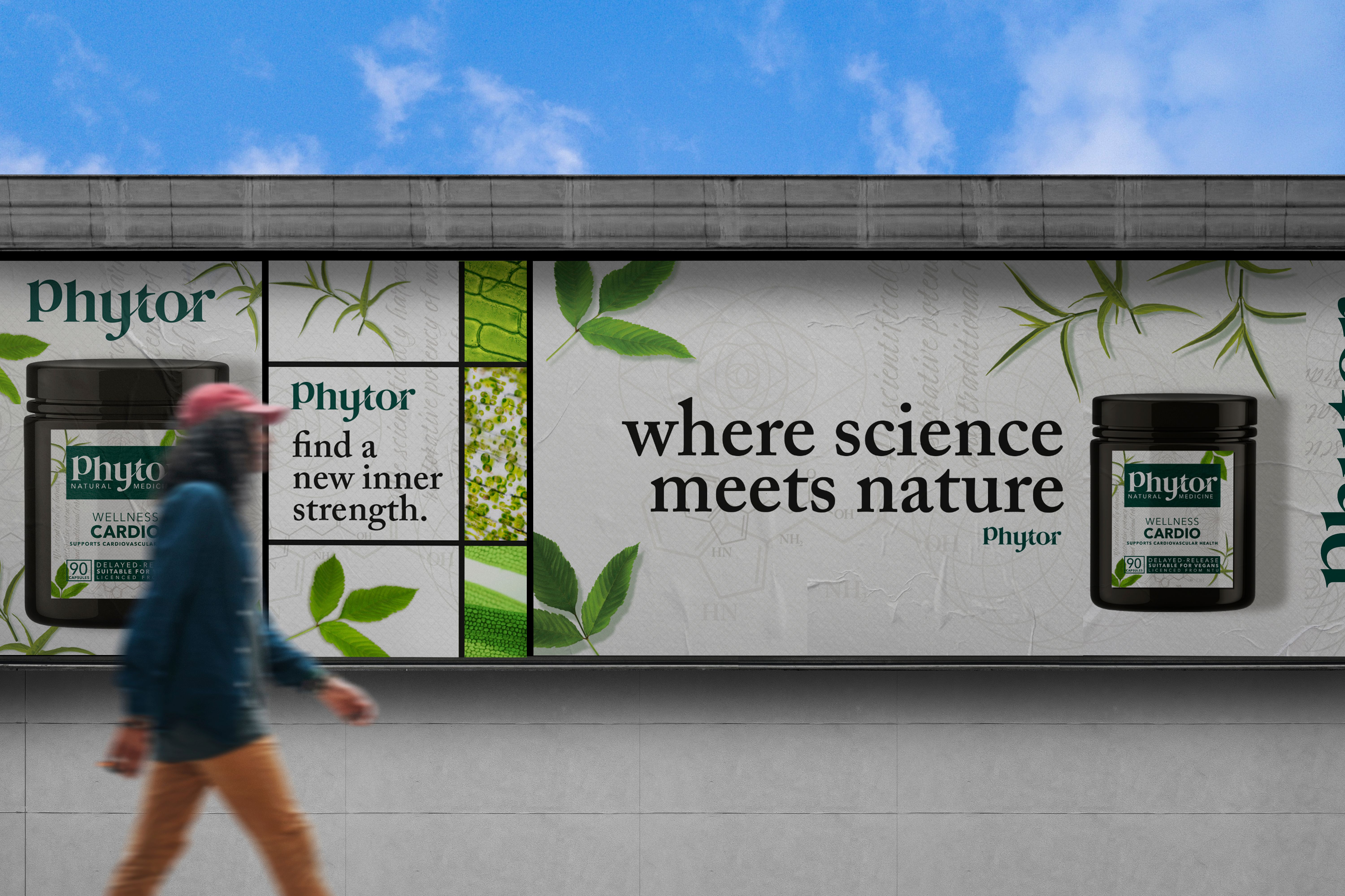
Straits Biopharma came to us to create a brand for their unique proprietary phytomedicinals after combining rigorous science and the phytonutrients found in the herbs of traditional medicines, to help win the fight against chronic disease and metabolic imbalances.
An independent strategic
brand design agency.
brand design agency.
Phytor
Services
Brand strategy / Brand identity / Packaging design
Sector
Pharmaceuticals
Region
Asia-Pacific
The Challenge
Our Approach
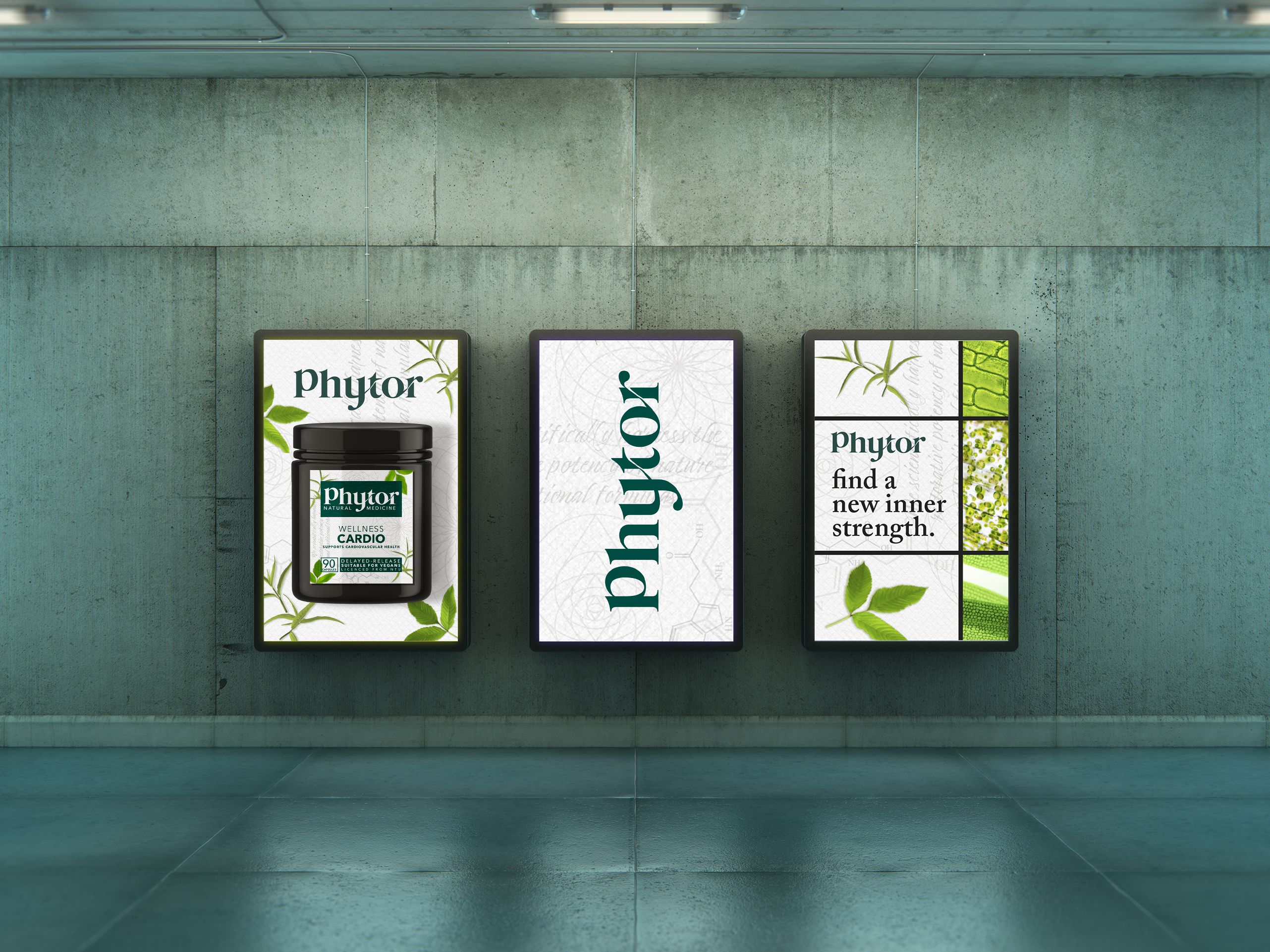
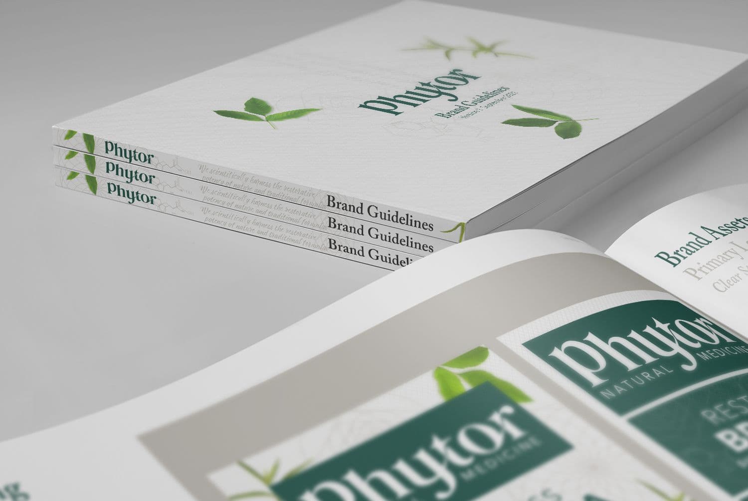
We defined the duality of science and nature in the brand's proposition; ‘Scientifically harnessing the restorative potency of nature and traditional formulas’. A reason to believe 'Where science meets nature’. A tone of voice that reflects Phytor's personality, with an enabling language and call to action 'Find a new inner strength’. And a lexical and compound brand name, Phytor, to reflect the brands strong product properties. Inspired by the word, Phytonutrients, and ‘Phyto' used as a prefix relating to 'plant' in biology terms. Phytor cues associations to the words 'fighter' and 'doctor', capturing the brands collective belief in nature's healing powers.

The Solution
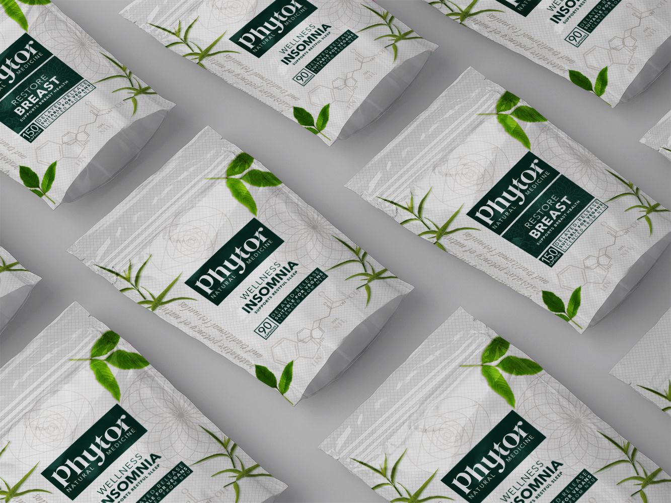
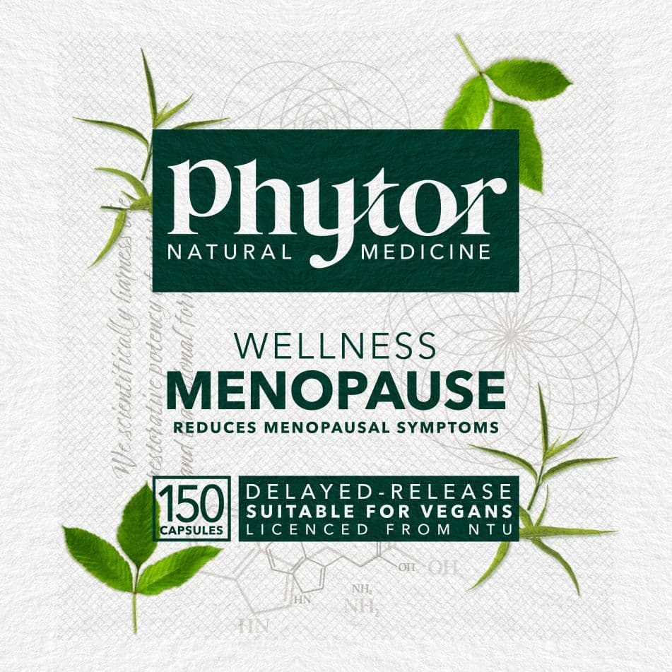
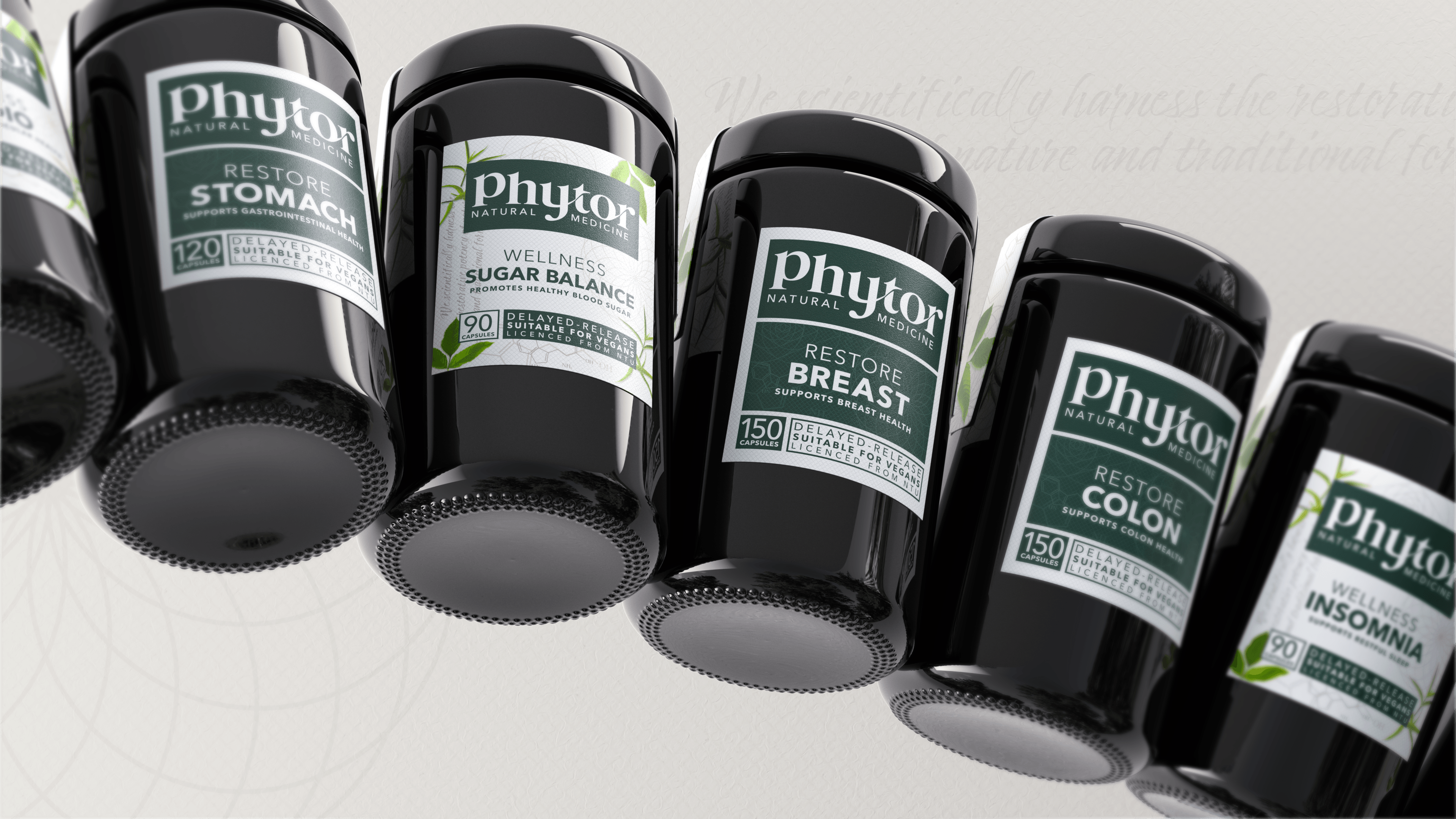
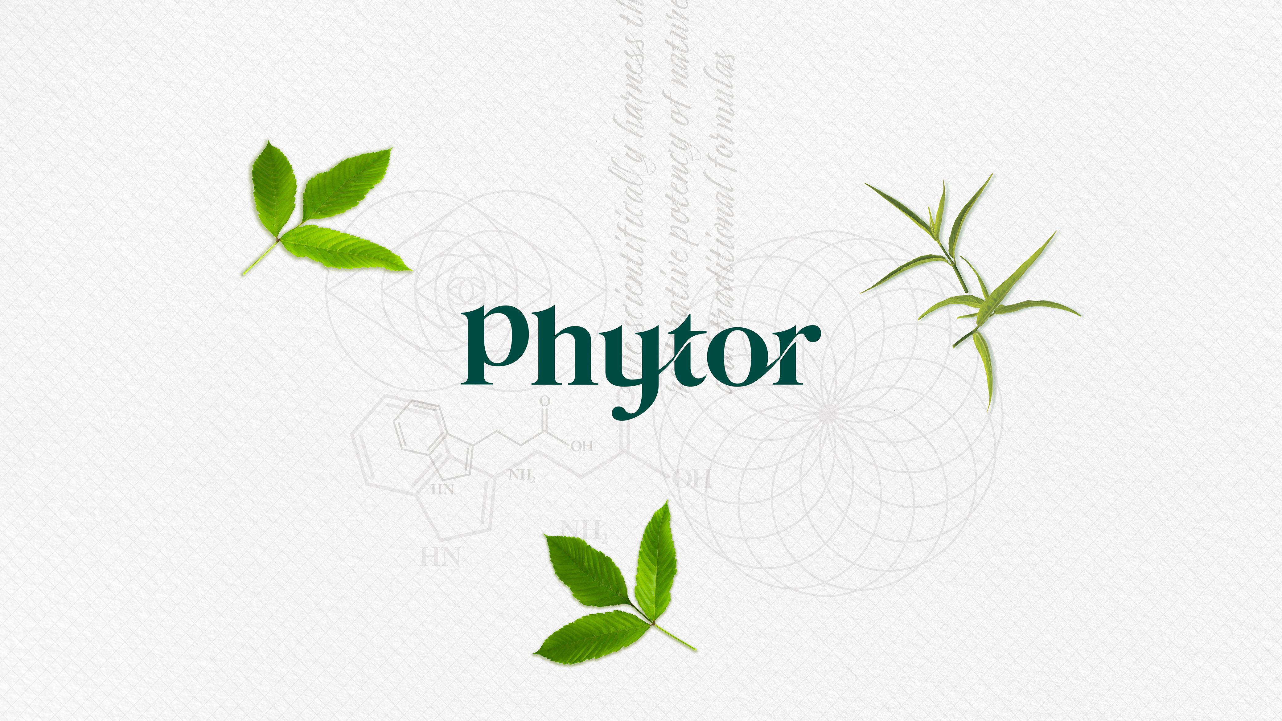
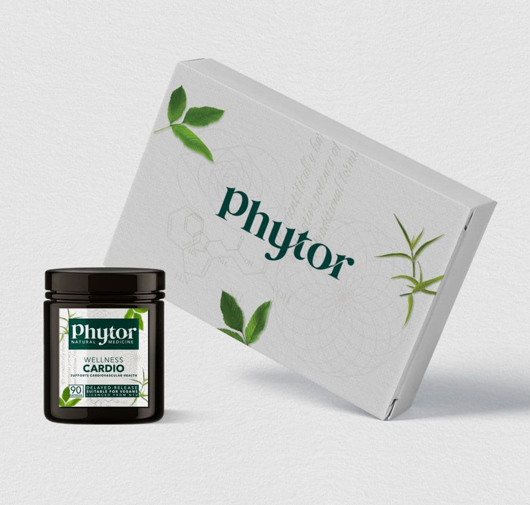
Looking at emergent semiotic codes, we created a differentiating and distinct visual language evoking science, traditional formulas, and nature. Our key imagery is a mix of real botanical ingredients and the active ingredients from under the microscope alongside harder pharmaceutical codes. The identity has flowing forms of nature in the wordmark, intertwining letters inspired by the vines of the gardens. Whilst our pattern, inspired by the Fibonacci sequence is created using traditional formulaic symbols, tryptophan molecules and our brand purpose, handwritten on parchment paper with a diagonal grid, implicit of the modern science and centuries of traditional wisdom. featuring green, white, grey, and black. The packaging itself is constructed, akin to a periodic table, bringing forward the pharmaceutical language.